A Jewel Tone Virginia Highlands Primary Bedroom

This Virginia Highlands family built their modern Atlanta home several years ago. While most of the house felt complete, the primary bedroom design never quite reflected who they were. It lacked warmth, personality, and that layered, luxurious feeling a bedroom retreat should have.
The space already had beautiful bones—abundant natural light and stunning golden hardwood floors. The couple had recently invested in a new upholstered bed and an ultra-soft rug, and they wanted those pieces to anchor the redesign. I’m always happy to incorporate existing furniture into a project; it creates a natural starting point and ensures the space feels personal rather than replaced.
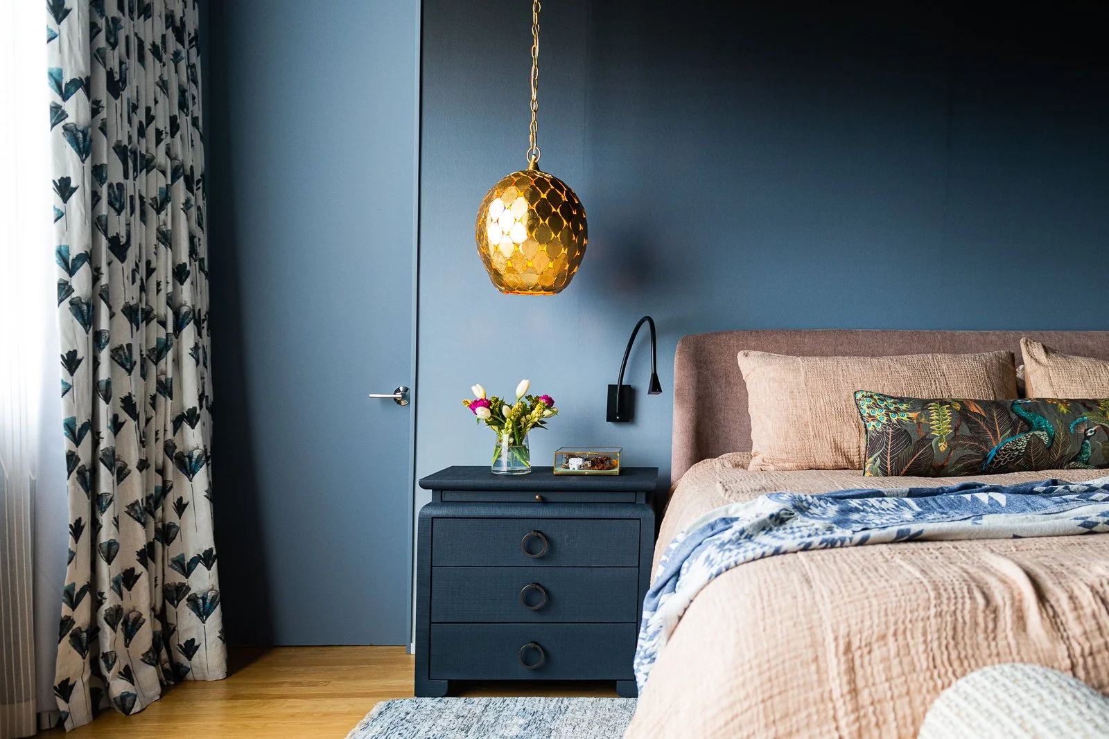
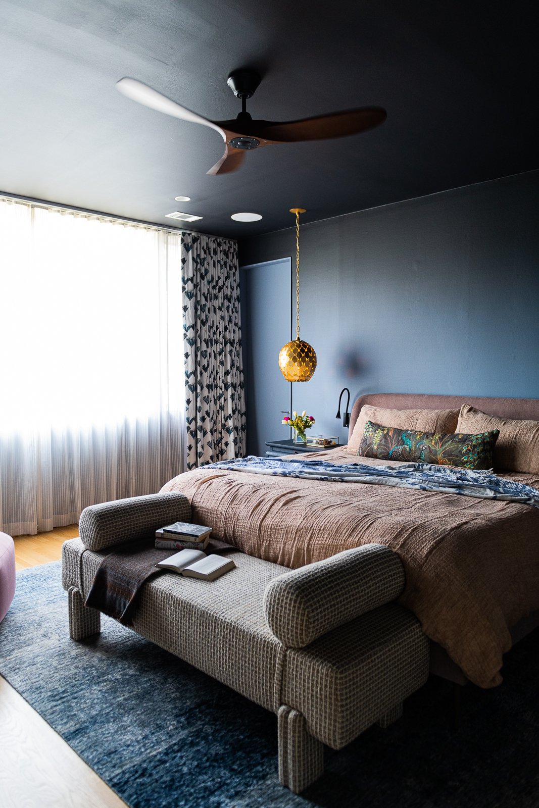
In this case, those two elements guided our entire color story. The dusty pink headboard and the blue-and-white rug called for a sophisticated approach to jewel tones. Rather than leaning too sweet or pastel, we deepened the palette with a rich navy as the dominant color. We layered in a pinky-purple chaise to enrich the blush tones and introduced terracotta neutrals, deep browns, and warm gold accents to ground the space. The result is a moody, jewel-toned primary bedroom that feels bold, balanced, and beautifully refined.

We began with the primary bedroom floor plan, keeping the bed in its original location since it was already well positioned within the room. Ideally, I love pairing a king-sized bed with generously scaled nightstands—it helps the room feel balanced and substantial. In this case, we were limited by closet access on both sides, but we were able to increase the nightstand width by about five inches, which made a meaningful difference in proportion.
If space had allowed, I also would have gone larger with the area rug. A properly scaled rug not only anchors the furniture, but it visually expands the room and adds that extra layer of luxury underfoot.
Below is the final bedroom design board showcasing the selected furnishings and materials. One of the things I prioritize in every project is integrating existing pieces so clients can clearly see how everything relates. You’ll notice the bench shown in its base form before upholstery, along with the nightstands as they originally came. We updated the hardware to better align with the jewel-toned palette—because it’s often those small, thoughtful details that elevate a room from good to exceptional.

The final reveal should never feel like a shock, but it should absolutely feel better than the digital presentation. My goal is always for the real-life space to exceed expectations, with richer texture, deeper color, and a warmth that simply can’t be captured on a screen.
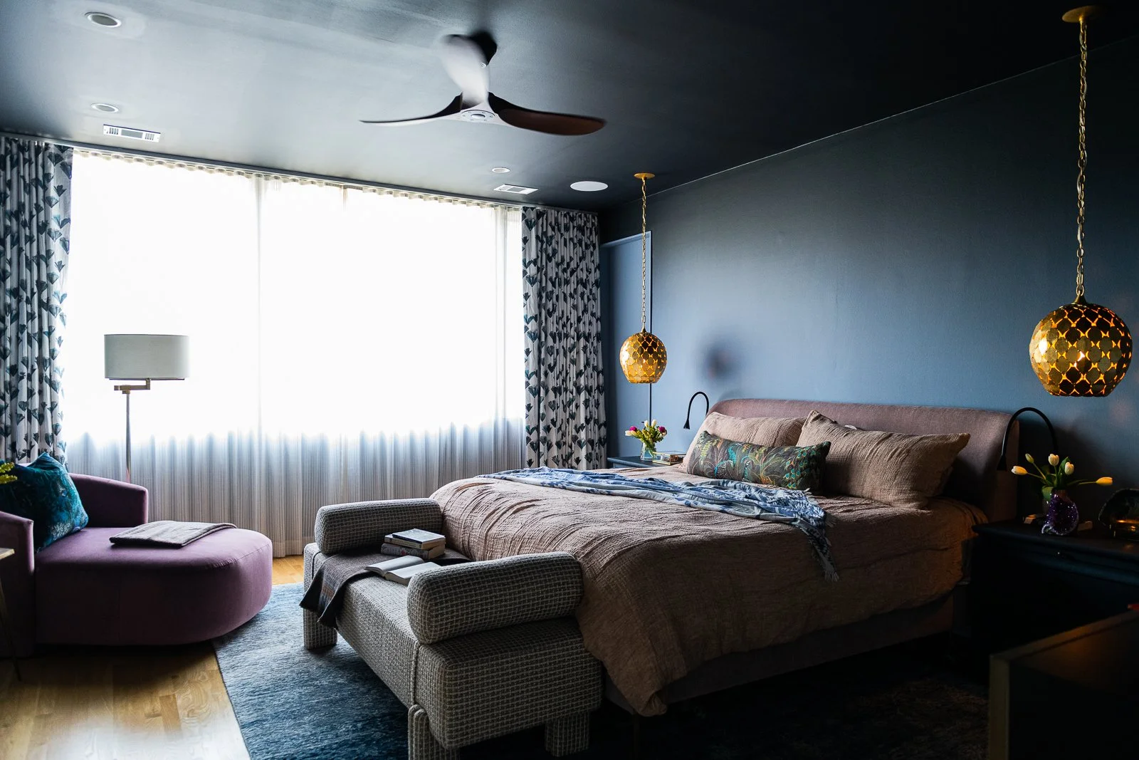
We wrapped the walls in a dramatic dark blue ombré wallpaper and color-matched the ceiling and trim so the entire room feels enveloped in color. That continuity creates a cocoon-like effect—moody, cozy, and incredibly restful.
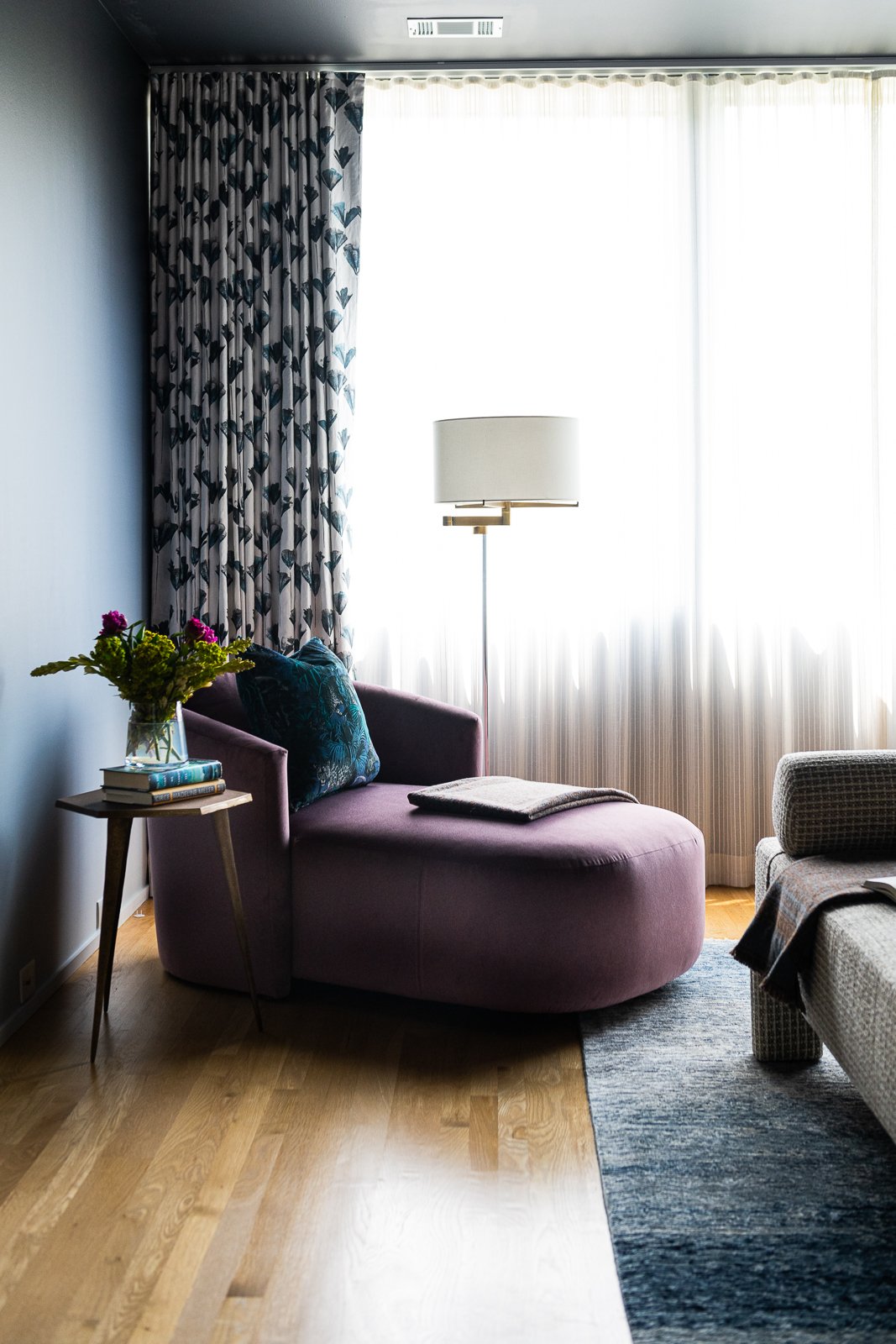
To soften the architecture and control light, we layered the windows with two treatments. A striped sheer adds subtle texture and movement during the day, while a beautifully printed linen blackout drapery provides privacy and that essential hotel-like sleep experience at night.
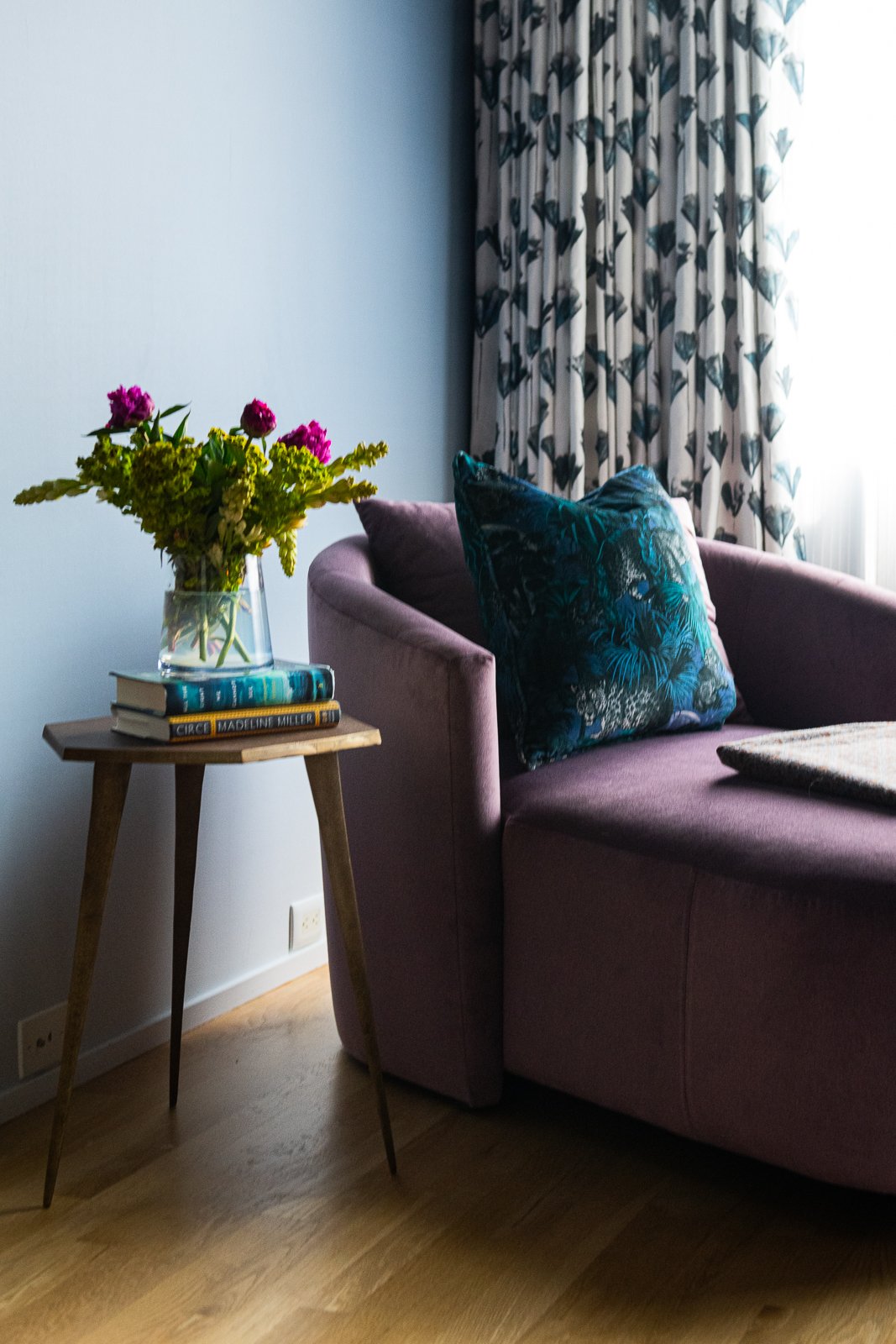
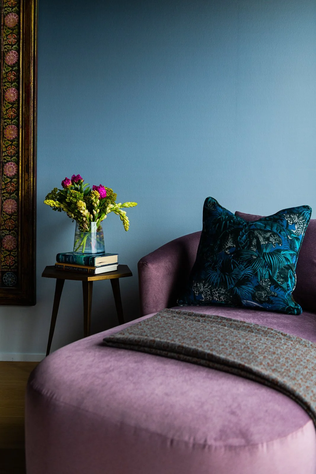
In the corner, we introduced a custom upholstered chaise to add both softness and function. Paired with a petite side table, a velvet pillow, and a sculptural lamp, it creates the perfect quiet moment within the room—a place to read, unwind, or simply pause at the end of the day.

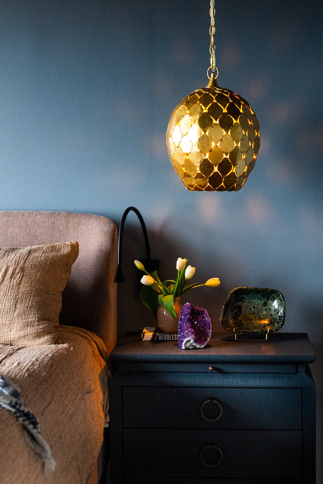
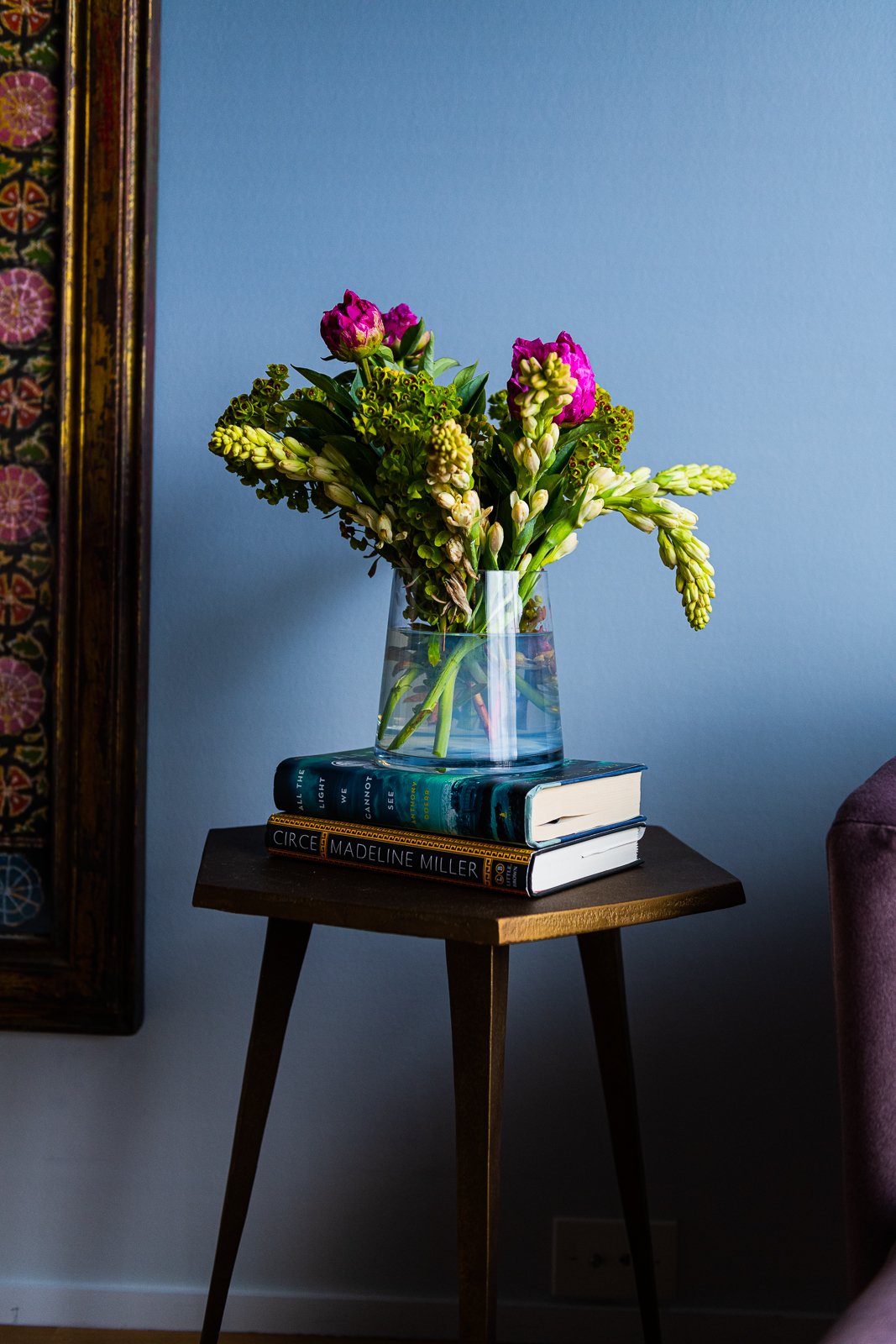
Fresh flowers always make things beautiful too.
We introduced a dose of drama with sculptural brass pendants suspended over the nightstands. I love how the warm metal catches the light and glows against the matte blue walls—it’s that contrast that makes the room feel layered and intentional. To balance beauty with function, we also added sleek black minimalist reading lights, giving each side of the bed its own practical light source.
In the image below, you can see the drapery detail more clearly. Linen has that effortless, slightly rumpled quality that makes a room feel relaxed and lived-in rather than overly polished.
I’m always drawn to tone-on-tone moments, so I initially advocated for deeper blue bedding to fully embrace the cocoon effect. The homeowners preferred not to lean too heavily into blue, so for the photoshoot we experimented with terracotta bedding. It adds warmth, but I’d love to see the hue deepen even further. I also think there’s an opportunity to introduce textile art above the bed—something layered and dimensional to complete the story and bring even more richness to the space.
The way the light filters through the brass pendants and softly reflects against the walls is one of my favorite details—it adds movement and warmth in the most subtle way.
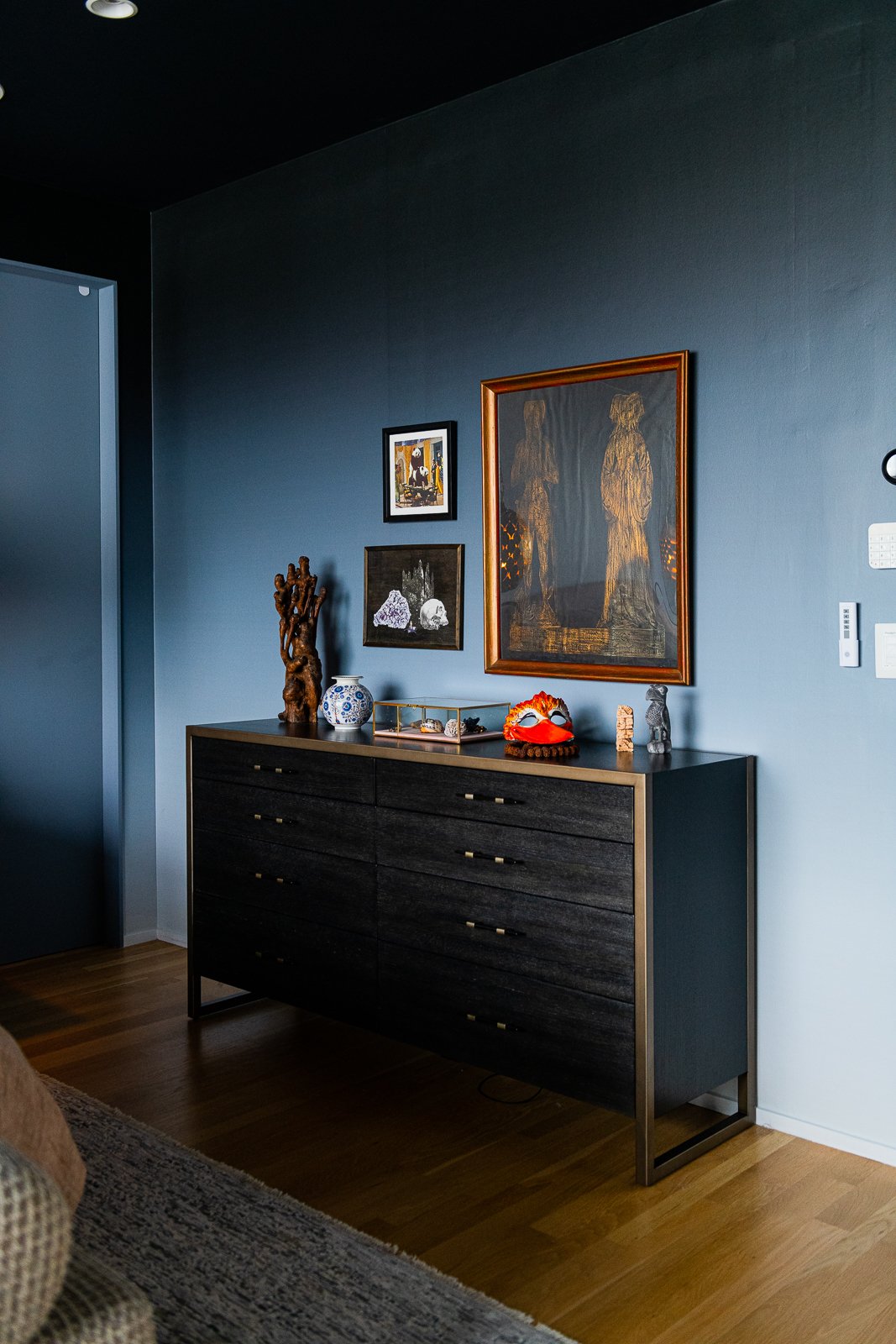
This couple has collected so many meaningful pieces from their travels, so I did what I often do: I “shopped” their home. We pulled together artwork and special objects to style the dresser in a way that feels personal and layered. In the photo below, you can really see the depth of the ombré wallpaper—the way it shifts in tone adds such beautiful dimension to the room.
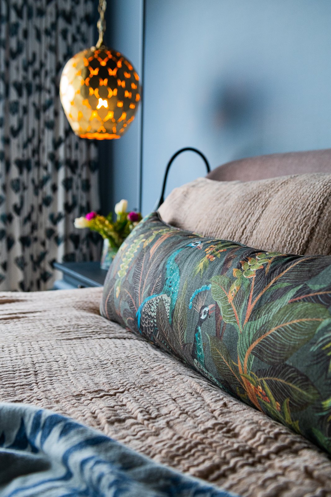
Here’s a closer look at the custom lumbar pillow—this fabric is absolutely dreamy. The subtle variation in tone and texture ties the entire palette together in such a refined way.
At the foot of the bed, we designed a custom bench made specifically for this space. It’s generously scaled, upholstered in a soft neutral fabric with beautiful texture, and adds both volume and balance to the room. Pieces like this bring warmth and softness while also grounding the bed composition.
Here’s a look at the rest of the furnishings we selected—right down to the pillows. Every layer was chosen with intention to support the jewel-toned palette and the relaxed, cocoon-like feel of the room.
We added a sculptural brass side table beside the chaise, which I absolutely love. The warmth of the metal ties back to the pendants and adds just the right amount of shine. While we ultimately didn’t need to source new artwork (they already had beautiful, collected pieces), including art in the design presentation helped establish the overall mood and ensure everything felt cohesive from the start.

You can’t quite see it in these photos, but on the large wall to the left of the chaise we hung a substantial piece of artwork the couple already owned. It had been tucked away in a lesser-used part of the house, and bringing it into the primary bedroom gave it the presence it deserved. The color it introduces is beautiful, but even more importantly, it holds meaning for them—which is always my favorite kind of art.
The end.
Interested in working together on your Atlanta interior design project? Book a discovery call to see if Violet Marsh Interiors is a fit. Please cruise around the site using the navigation links below and please do let me know how I can help.
Join the Party.
We promise not to bother you too much, but if you’d like to be alerted to new before & after blog content, please submit your details below.